ARMRA

With the modern environment evolving and everyday chemicals, pollutants, pathogens, and processed ingredients threatening our mental and physical state, our bodies need protection now more than ever.
Bovine colostrum evolved 300 million years ago and has been harnessed for its health benefits for thousands of years dating back to Ayurvedic medicine. It was used to treat infections before the advent of antibiotics and is clinically backed by thousands of peer-reviewed research publications. It addresses a foundational pathway in the body and is safe for all ages, effective with a long track record of use. However, it remains largely unknown to the mass consumer.
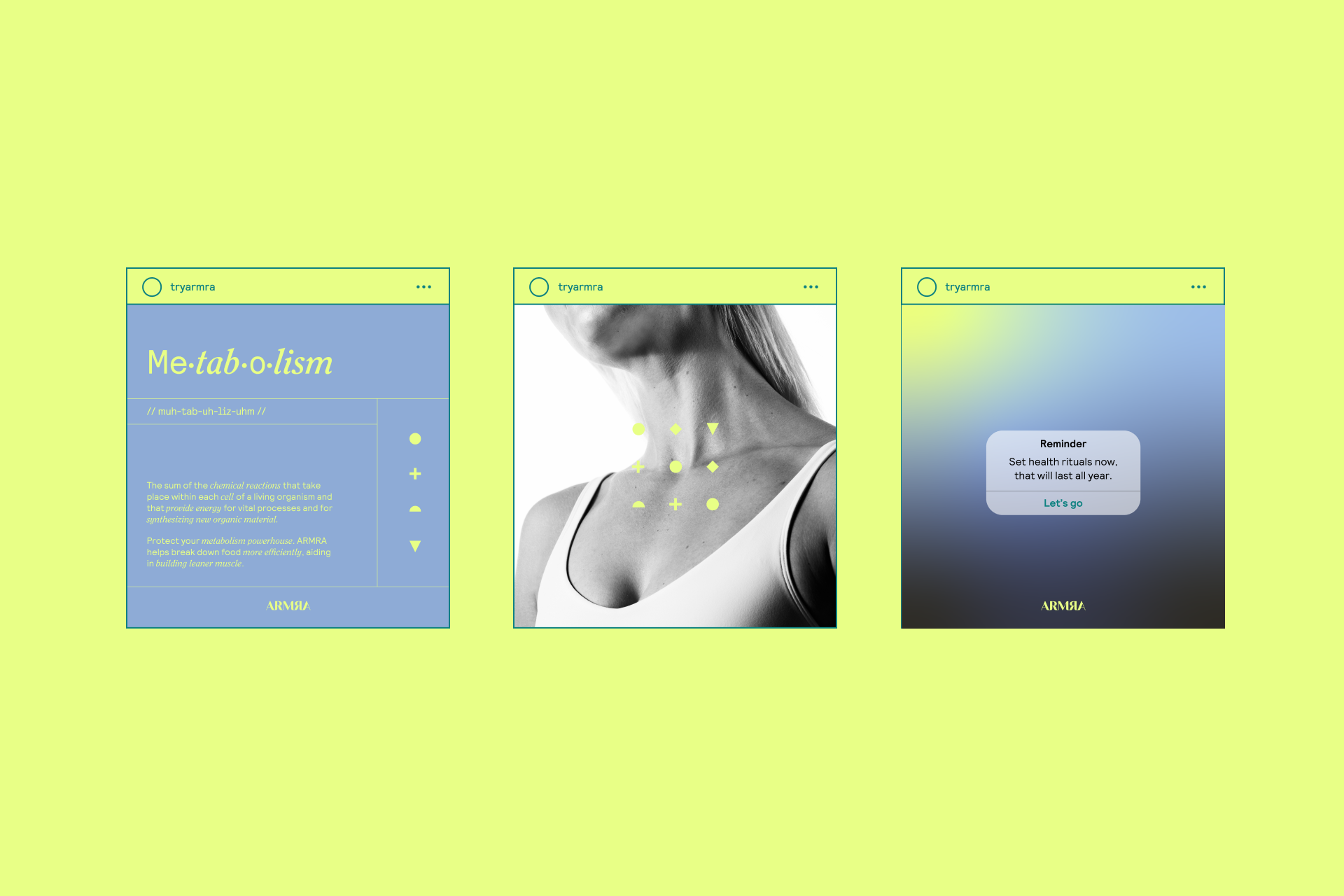
ARMRA is a DTC colostrum supplement brand that was looking to rebrand to better attract consumers and represent their product. The goal was to create a brand that speaks to the natural-wellness qualities of the product and appeals to a fitness-minded consumer. We partnered with them to create a new brand system including strategy, identity, packaging, art direction, and social content.


“The body has the powerful ability to heal itself when equipped with the right nutrients to do so.”
ARMRA knew it had the right product but struggled to articulate its impact, as the supplement carries many benefits that impact many aspects of life. In addition, health enthusiasts commonly weren’t aware of ARMRA’s physician-developed product that preserves 200+ nutrients.
Committed to developing products with transparency, scientific rigor, and safety, it was essential that ARMRA’s rebrand represented the brand’s key company values and differentiators.


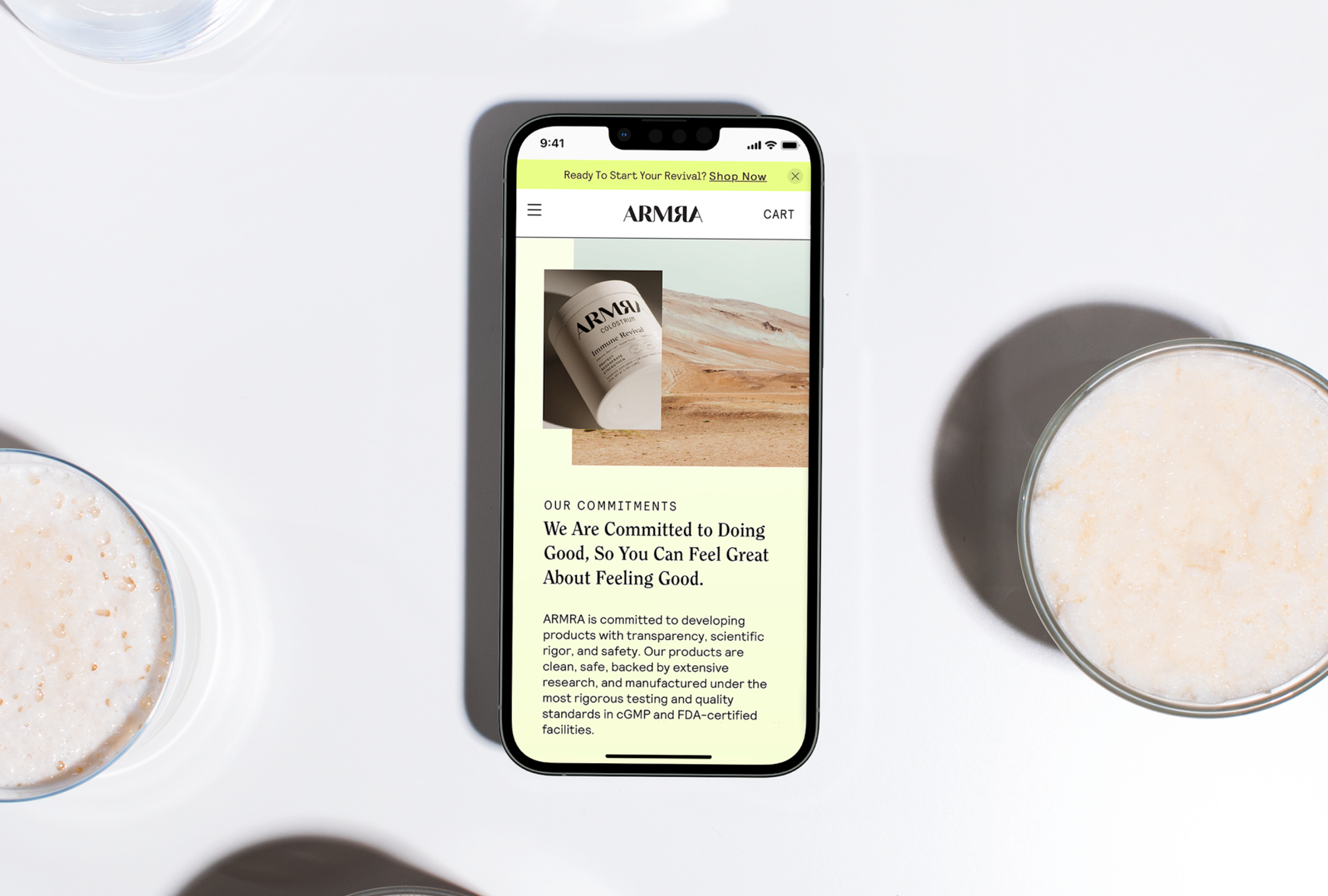

The revival of health.
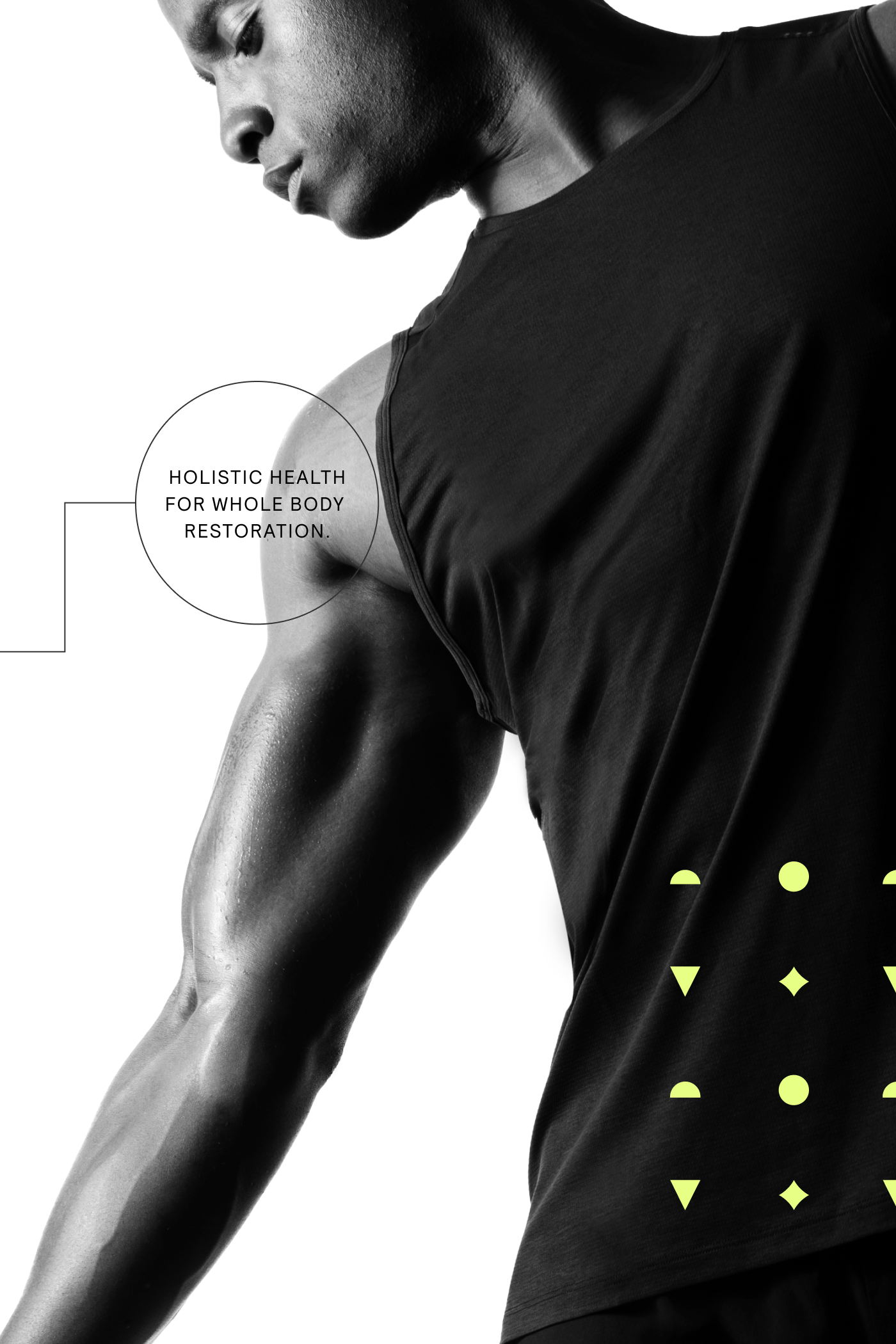
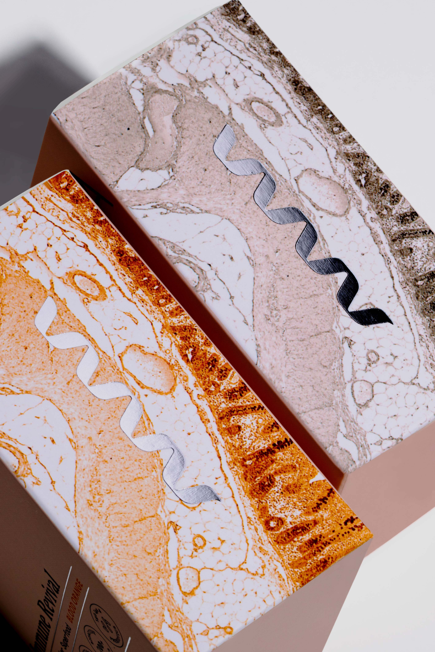
To capture consumers, we developed new messaging that highlighted ARMRA’s points of differentiation and emphasized tangible benefits. Visually, we leaned into stark contrasts and striking photography that would capture consumers’ attention.
Through our comprehensive branding exercise, we connected the different aspects of ARMRA to tell a cohesive brand story. By creating a refreshed brand narrative and brand pillars, we were able to effectively convey the brand’s reason for being, greater mission, and consumer benefits.
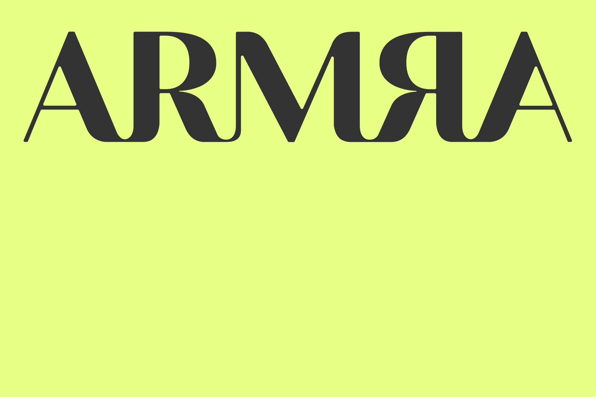
The custom connected ligatures convey a solid, strong, anti-fragile statement and the reversed R and A create a beautiful symmetry in the mark.
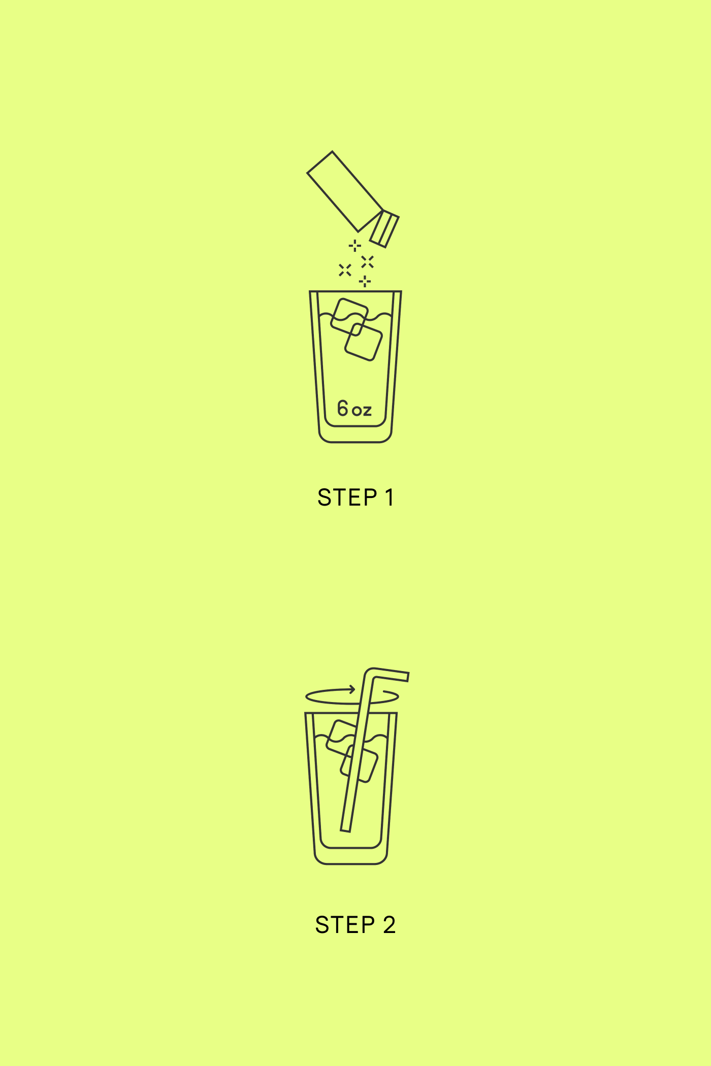
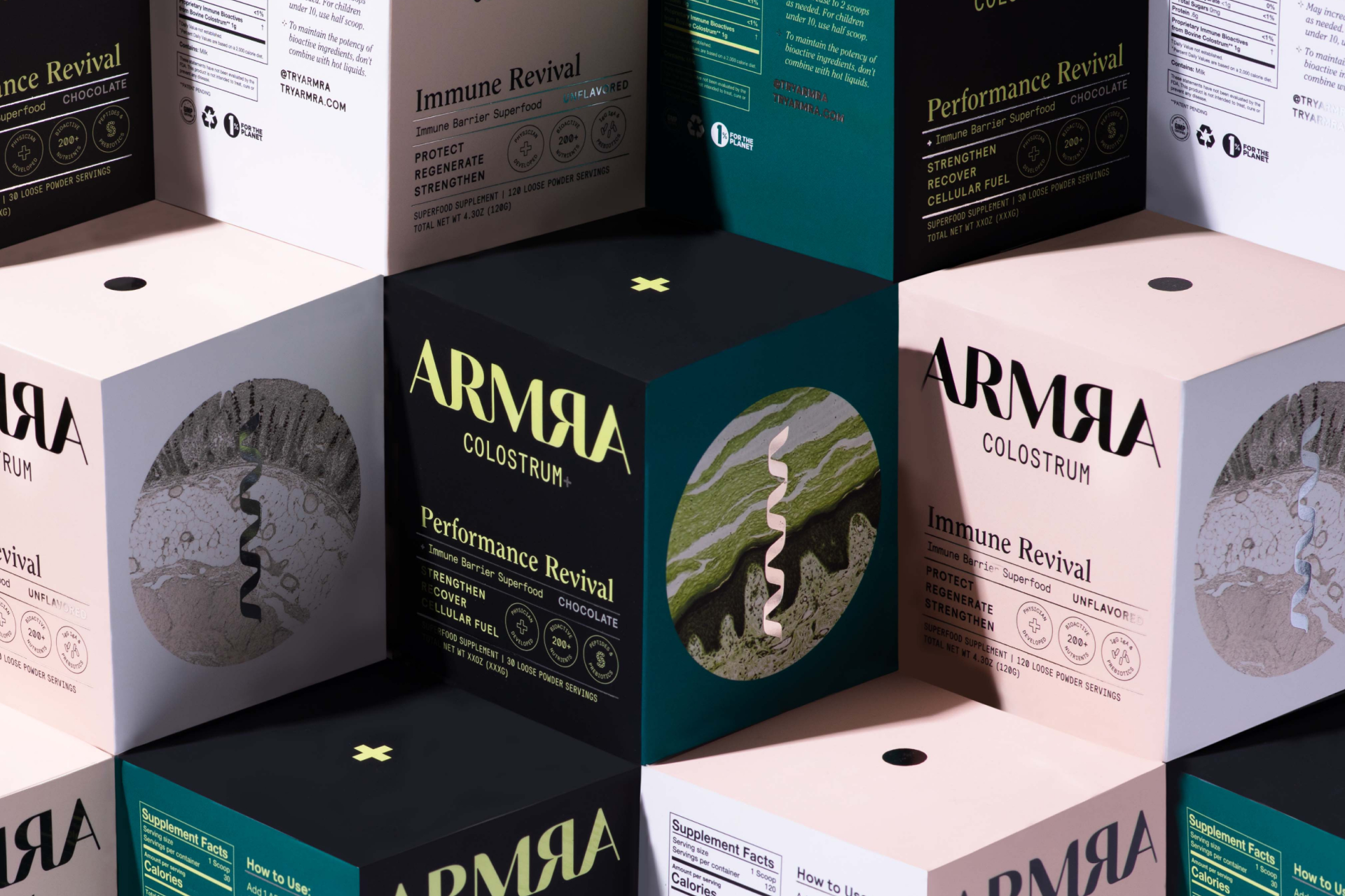
Using consumer insights, we extended ARMRA’s packaging design to clearly communicate the value proposition for an impactful experience that is easily digestible from a store aisle.





Role
Design DirectionCredit
Design: Sarah Johnson, Whitney Mckenzie, Annie FranceStrategy: Nick McVey, Jenna Frank
Art Direction: Kaya Morris, Bethany Schrock
Video Direction: Joey Hamburger
Retouching: Elle Pollock
-
Done at The Stable